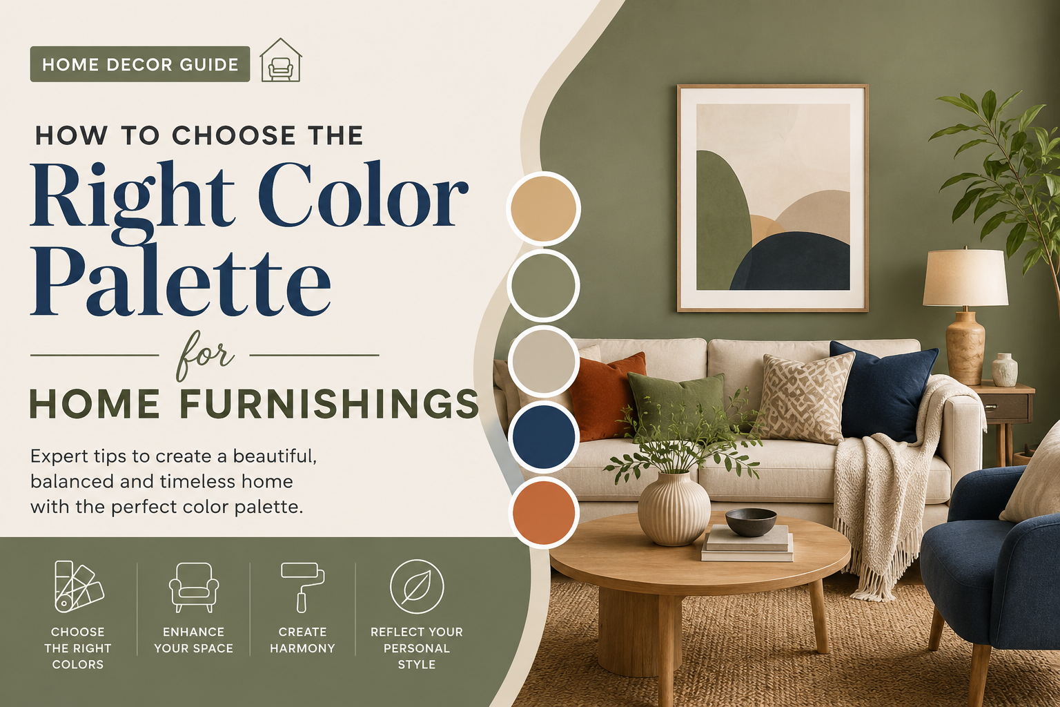
Introduction
Choosing the perfect colors for your home can completely transform the look and feel of your living space. Whether you are decorating a new home or refreshing an existing one, selecting the right home furnishings color palette is one of the most important design decisions you will make. Colors influence mood, create visual harmony, and help define the personality of a room.
From sofas and curtains to rugs, cushions, and wall décor, every furnishing element contributes to the overall color scheme. With so many options available, choosing the right palette can feel overwhelming. This guide will help you understand how to create a balanced and stylish color palette that complements your home and reflects your personal taste.
Why Your Home Furnishings Color Palette Matters
A well-planned home furnishings color palette does more than make a room look attractive. It helps create a cohesive environment where every element works together seamlessly. The right colors can:
- Make small rooms appear larger
- Create a cozy and inviting atmosphere
- Enhance natural light
- Reflect your personality and lifestyle
- Increase the visual appeal of your interiors
When colors are chosen thoughtfully, they can turn an ordinary space into a beautifully designed home.
Start with the Purpose of the Room
Before selecting colors, consider how the room will be used. Different spaces serve different functions, and your color choices should support those activities.
Living Room
Warm neutrals, earthy tones, and soft blues create a welcoming environment where family and guests can relax.
Bedroom
Calming colors such as light gray, beige, sage green, and soft lavender promote rest and relaxation.
Dining Room
Rich colors like deep green, navy blue, or warm terracotta can create a sophisticated and inviting dining experience.
Home Office
Productive spaces often benefit from colors like blue, green, or muted neutrals that encourage focus and concentration.
Understanding the room’s purpose helps narrow down the best home furnishings color palette for the space.
Consider Existing Elements
One of the biggest mistakes homeowners make is choosing furnishings before considering existing design elements.
Take a look at:
- Flooring
- Wall colors
- Ceiling color
- Architectural features
- Existing furniture
These elements already contribute to your room’s visual identity. Your furnishings should complement rather than clash with them. For example, warm wooden floors pair beautifully with earthy and neutral tones, while cool gray flooring often works best with blues, whites, and charcoal shades.
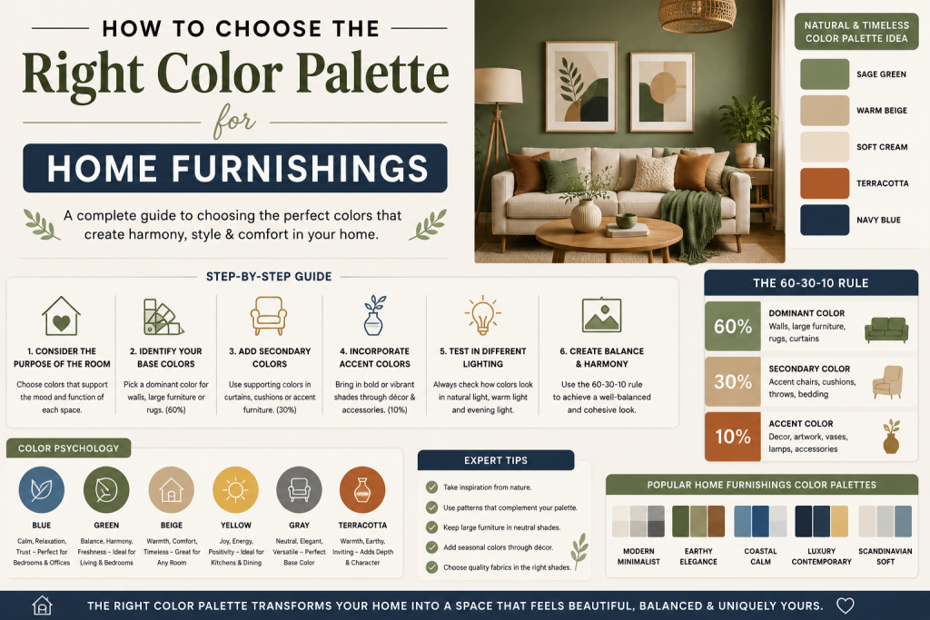
Follow the 60-30-10 Rule
Interior designers often use the 60-30-10 rule to create balanced color schemes.
60% Dominant Color
This is the primary color of the room, often seen in walls, large furniture pieces, or area rugs.
30% Secondary Color
This supports the dominant color and appears in curtains, accent chairs, bedding, or storage furniture.
10% Accent Color
Used for decorative items such as cushions, artwork, vases, and throws to add visual interest.
For example:
- 60% Beige
- 30% Soft Gray
- 10% Navy Blue
This formula creates a harmonious home furnishings color palette that feels balanced rather than overwhelming.
Understand Color Psychology
Colors affect emotions and perceptions. Understanding color psychology can help you choose shades that support the mood you want to create.
Blue
Associated with calmness, trust, and relaxation. Ideal for bedrooms and home offices.
Green
Represents nature, balance, and freshness. Works well in living rooms and bedrooms.
Yellow
Adds warmth, energy, and positivity. Great for kitchens and dining spaces.
Gray
Modern, sophisticated, and versatile. Often used as a neutral foundation.
Beige and Cream
Timeless and comforting colors that work in almost every room.
Black
Adds depth and elegance when used as an accent color.
By understanding how colors influence mood, you can build a home furnishings color palette that enhances the atmosphere of your home.
Choose Between Warm and Cool Tones
Colors generally fall into two categories:
Warm Colors
- Beige
- Terracotta
- Mustard
- Warm browns
- Soft reds
Warm palettes create cozy and inviting spaces.
Cool Colors
- Blue
- Gray
- Green
- Lavender
- White
Cool palettes create calm, spacious, and modern environments.
While both styles can be beautiful, maintaining consistency throughout a room helps create a more cohesive design.
Take Inspiration from Nature
Nature provides some of the most timeless and harmonious color combinations.
Popular nature-inspired palettes include:
Coastal Palette
- Sandy beige
- Soft blue
- Crisp white
Forest Palette
- Sage green
- Brown
- Cream
Desert Palette
- Terracotta
- Warm beige
- Muted olive
These combinations naturally work well together and create visually pleasing interiors.
Test Colors Before Making Final Decisions
Lighting can significantly affect how colors appear in your home.
A fabric that looks gray in a showroom may appear blue or beige under your home’s lighting conditions.
Before purchasing major furnishings:
- Request fabric samples
- Test paint swatches
- Observe colors during different times of the day
- Compare materials under natural and artificial light
This simple step can prevent costly decorating mistakes.
Use Patterns Carefully
Patterns can add personality and depth to a room, but they should complement your color palette rather than compete with it.
When mixing patterns:
- Keep a consistent color scheme
- Combine large and small patterns
- Balance bold designs with solid colors
- Avoid using too many competing prints
For example, a neutral sofa can be enhanced with patterned cushions that incorporate accent colors from your overall home furnishings color palette.
Think About Long-Term Appeal
Trendy colors can be exciting, but they may not remain appealing over time.
Consider using timeless shades for larger furnishings such as:
- Sofas
- Beds
- Dining tables
- Cabinets
You can introduce seasonal or trendy colors through accessories like cushions, throws, and decorative items. This allows you to update your décor without replacing major furniture pieces.
Popular Home Furnishings Color Palettes for 2026
Some of the most popular color combinations include:
Modern Minimalist
- White
- Light gray
- Black accents
Earthy Elegance
- Beige
- Olive green
- Warm brown
Luxury Contemporary
- Navy blue
- Gold accents
- Cream
Scandinavian Style
- White
- Soft gray
- Natural wood tones
Organic Modern
- Sage green
- Stone gray
- Off-white
These palettes offer versatility while maintaining a stylish and contemporary appearance.
Conclusion
Selecting the perfect home furnishings color palette is about finding the right balance between aesthetics, functionality, and personal preference. By considering the purpose of the room, understanding color psychology, using the 60-30-10 rule, and testing colors before committing, you can create a space that feels both beautiful and comfortable.
Remember that the best color palette is one that reflects your personality while creating harmony throughout your home. Whether you prefer warm earthy tones, calming neutrals, or bold contemporary contrasts, a thoughtfully chosen color scheme will help transform your home into a space you truly love.